Section 5.1 Linear Equations
Objectives
Translate problems from a variety of contexts into mathematical representation and vice versa (linear, exponential, simple quadratics).
Identify when a linear model is reasonable for a given situation and, when appropriate, formulate a linear model. In the context of the situation interpret the slope and intercepts and determine the reasonable domain and range.
Use functional models to make predictions and solve problems.
Subsection 5.1.1 Four Representations of a Relationship
In 2002, the poverty rate of each state in the United States of America (plus D.C. and Puerto Rico) were recorded, as well as the number of births performed by teenage mothers ages 15-17. The data is plotted below, along with a trend line of best fit.
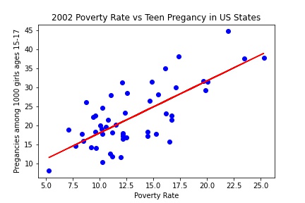
The units for the \(x\)-axis are people below the poverty line per 100 people in each state or territory. The \(y\)-axis is measured in births per 1000 girls ages 15-17 for each state or territory.
A graph provides a visual representation of the situation. It helps you see how the variables are related to each other and make predictions about future values or values in between those in your table. The horizontal and vertical axis of the graph should be labeled, including units.
The equation for the red line is
This is an equation for a model. This equation is useful because it can be used to calculate the expected teen pregnancy rate given a state's poverty rate. Equations are useful for communicating complex relationships. In writing equations, it is always important to define what the variables represent, including units. For example, in the equation above, \(T \) is in births per 1000 girls ages 15-17, and \(P\) is in people living in a household below the poverty line per 100 people.
Another way that you could have represented this relationship is in a table that shows values of t and B as ordered pairs. An ordered pair is two values that are matched together in a given relationship. You used a table in the last lesson. Tables are helpful for recognizing patterns and general relationships or for giving information about specific values. A table should always have labels for each column. The labels should include units when appropriate.
| Location | PovPct | Model-Brth15to17 |
| Illinois | 12.4 | 21.3 |
| Indiana | 9.6 | 17.5 |
| Kentucky | 14.7 | 24.5 |
| Michigan | 12.2 | 21.0 |
| Ohio | 11.5 | 20.1 |
The values of “Model-Brth15to17” are not the actual values, but instead, they are the predicted values using our equation above. We can compare our predicted values with the actual values by including that column.
| Location | PovPct | Actual-Brth15to17 | Model-Brth15to17 |
| Illinois | 12.4 | 23.4 | 21.3 |
| Indiana | 9.6 | 22.6 | 17.5 |
| Kentucky | 14.7 | 26.5 | 24.5 |
| Michigan | 12.2 | 18 | 21.0 |
| Ohio | 11.5 | 20.1 | 20.1 |
In the table above, the last column represents points of our equation (the red line) while the second to last column are the actual numbers (corresponding to blue dots).
A verbal description explains the relationship in words. In this case, we can do that by looking at how the values in the formula affect the result. According to our model, we would expect a state with no poverty to have a pregancy rate among 1000 girls 15-17 at about 4.2673. And for any state whose poverty rate increases by 1 person per 100, the pregnancy rate for 1000 girls ages 15-17 is expected to go up 1.3733. So we could verbally describe the relationship as: A state's expected pregnancy rate per 1000 girls ages 15-17 is 4.2673 plus 1.3733 for every person per 100 living in a household below the poverty line.
Subsection 5.1.2 Linear Equations and Slope
The type of equation we looked at for poverty and teen pregnany is a linear equation, or a linear model. Recall that the graph of a linear equation is a line. The primary characteristic of a linear equation is that it has a constant rate of change, meaning that each time the input increases by one, the output changes by a fixed amount. In the example above, if one state as 1 more person per 100 below the poverty line than another state, then we expect the first state to have 1.3733 more pregnancies per 1000 girls 15-17 years old. This constant rate of change is also called slope.
Example 5.1.3.
If I were walking at a constant speed, my distance would change 6 miles in 2 hours. We could compute the slope or rate of change as
In general, we can compute slope as
In the graph shown, we can see that the graph is a line, so the equation is linear. We can compute the slope using any two pairs of points by counting how much the input and output change, and divide them. Notice that we get the same slope regardless of which points we use.
If the output increases as the input increases, we consider that a positive change. If the output decreases as the input increases, that is a negative change, and the slope will be negative.
Some people call the calculation of slope "rise over run", where "rise" refers to the vertical change in output, and "run" refers to the horizontal change of input.
The units on slope will be a rate based on the units of the output and input variables. It will have units of "output units per input units". For example,
Input: hours. Output: miles. Slope: miles per hour
Input: number of cats. Output: pounds of litter. Slope: pounds of litter per cat
Subsection 5.1.3 Slope Intercept Equation of a Line
The slope-intercept form of a line, the most common way you'll see linear equations written, is
where \(m\) is the slope, and \(b\) is the vertical intercept (called y intercept when the output variable is \(y\)). In the equation, \(x\) is the input variable, and \(y\) is the output variable.
Notice our equation from earlier,
fits this form where the slope is 1.3733 and the vertical intercept is 4.2673. The input variable is \(P\) and the output variable is \(T\text{.}\)